
You find a bio you like, copy it, and paste it into your profile. Then the tidy lines turn into a cramped block. The decorative hearts look bigger than the words, or the blank line you carefully placed disappears. The problem isn’t necessarily the wording; it is the way the text is arranged and displayed.
A useful bio should tell someone who you are or what the account shares before it tries to look impressive. The small design choices come next: one styled heading, one meaningful symbol and, only when necessary, a carefully tested spacing character. You don’t need a collection of fifty ornaments to make a short profile feel personal.
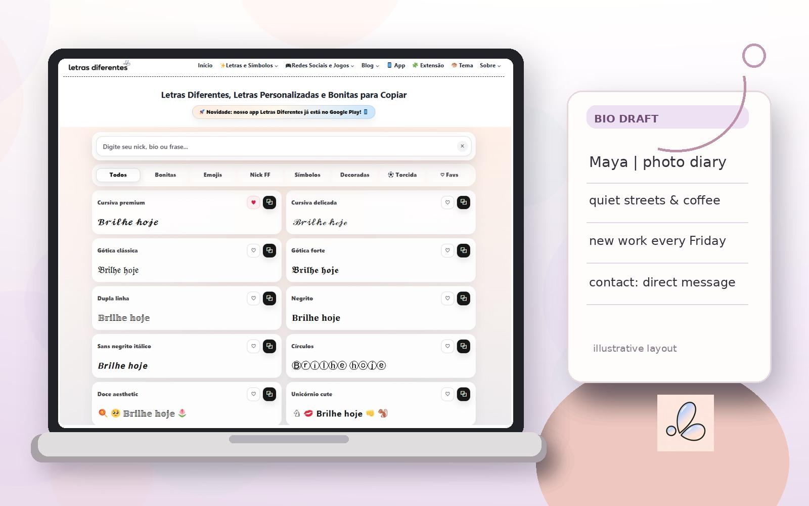
Editorial composition using a genuine Letras Diferentes Online generator screenshot and a fictional example bio. Start with three pieces of information, not three different fonts
Before decorating anything, write a bio using ordinary letters. A practical order is identity, interest or offer, and next step. The final line might be a contact method, a community invitation or a brief note about what you post. Personal accounts don’t always need a call to action, and a small project doesn’t need a dramatic slogan.
Suppose Maya runs a small photo diary. Her first draft reads: “Maya. I take street photographs, like coffee and walking, post every Friday, and welcome creative projects.” Nothing is wrong with those ideas, but they are difficult to scan when pressed into a single line.
A cleaner draft would be:
Maya | photo diary
quiet streets & coffee
new photos on Fridays
projects: direct message
The four lines have different jobs. A reader can identify the account, recognize its subject and find a useful next step without deciphering a decorative alphabet. If the profile has a strict character or line limit, shorten the least important detail first rather than shrinking everything into unusual symbols.
Give one short phrase a different look
Copyable letter styles work best on a small portion of the bio: a nickname, project title or introductory phrase. For instance, you might emphasize “Photo Diary” and leave the rest in regular lettering. That creates contrast without making every word a puzzle.
To compare alternatives, open a browser-based letras diferentes, type the same short phrase and inspect the results side by side. On Letras Diferentes Online, the main input accepts a nickname, bio or phrase; the homepage provides categories such as Bonitas (beautiful), Símbolos (symbols) and Decoradas (decorated), with copy buttons beside the styles. You do not have to install a traditional font to try them.
These are illustrative treatments of a simple heading:
Plain: Photo Diary
With a small accent: ✦ Photo Diary
Bold-looking Unicode: 𝗣𝗵𝗼𝘁𝗼 𝗗𝗶𝗮𝗿𝘆
Cursive-looking Unicode: 𝓟𝓱𝓸𝓽𝓸 𝓓𝓲𝓪𝓻𝔂
The first two are likely to be easier to recognize at small sizes. The others show why a preview isn’t the final test. Many so-called fancy fonts are actually alternate Unicode characters rather than installed typefaces. An app can display or process those characters differently, and screen readers may announce them in unexpected ways.
Add symbols that help explain the bio
A symbol is most useful when it acts like a visual label. A camera can signal photography, a musical note can suggest a music account, and a small star can draw attention to a project name. A string of five unrelated emojis makes a much less clear statement.
For a predictable result, start with one symbol before or after the heading. An online collection of simbolos para copiar lets you search by theme and browse categories; the tool also offers options to copy an individual character or add it to a nickname. Compare the symbol in your actual bio, not just in the gallery.
For Maya, these two options communicate almost the same idea:
Simple: ✦ Maya | photo diary
With a visual cue: 📷 Maya | photo diary
Neither needs a decorative symbol on every remaining line. Be especially cautious with checkmarks, badges or crowns that might falsely imply official verification or membership. A decorative mark should express the profile’s style, not make an unsupported claim about its status.
How to build and paste the bio step by step
1. Write the content first. Put the name, purpose and any essential next step into ordinary text. Delete repeated ideas.
2. Choose one heading. Try a short display name or project label in a few styles. Keep a plain-text copy for reference.
3. Pick one meaningful symbol. Use a star, heart, flower or relevant icon only if it makes the profile easier to recognize.
4. Arrange the lines. Put separate ideas on separate lines using the editor’s normal line-break controls wherever those controls are available.
5. Copy and paste into the actual app. Check line wrapping, punctuation and characters on the device where the profile will be viewed.
6. Simplify anything that looks crowded. If a symbol becomes a box or an ornate word is hard to read, replace it before saving.
One important distinction: copying a styled heading is not the same as changing a platform’s system font. You are pasting characters into a text field. The destination platform still decides which characters it permits and how they are rendered.
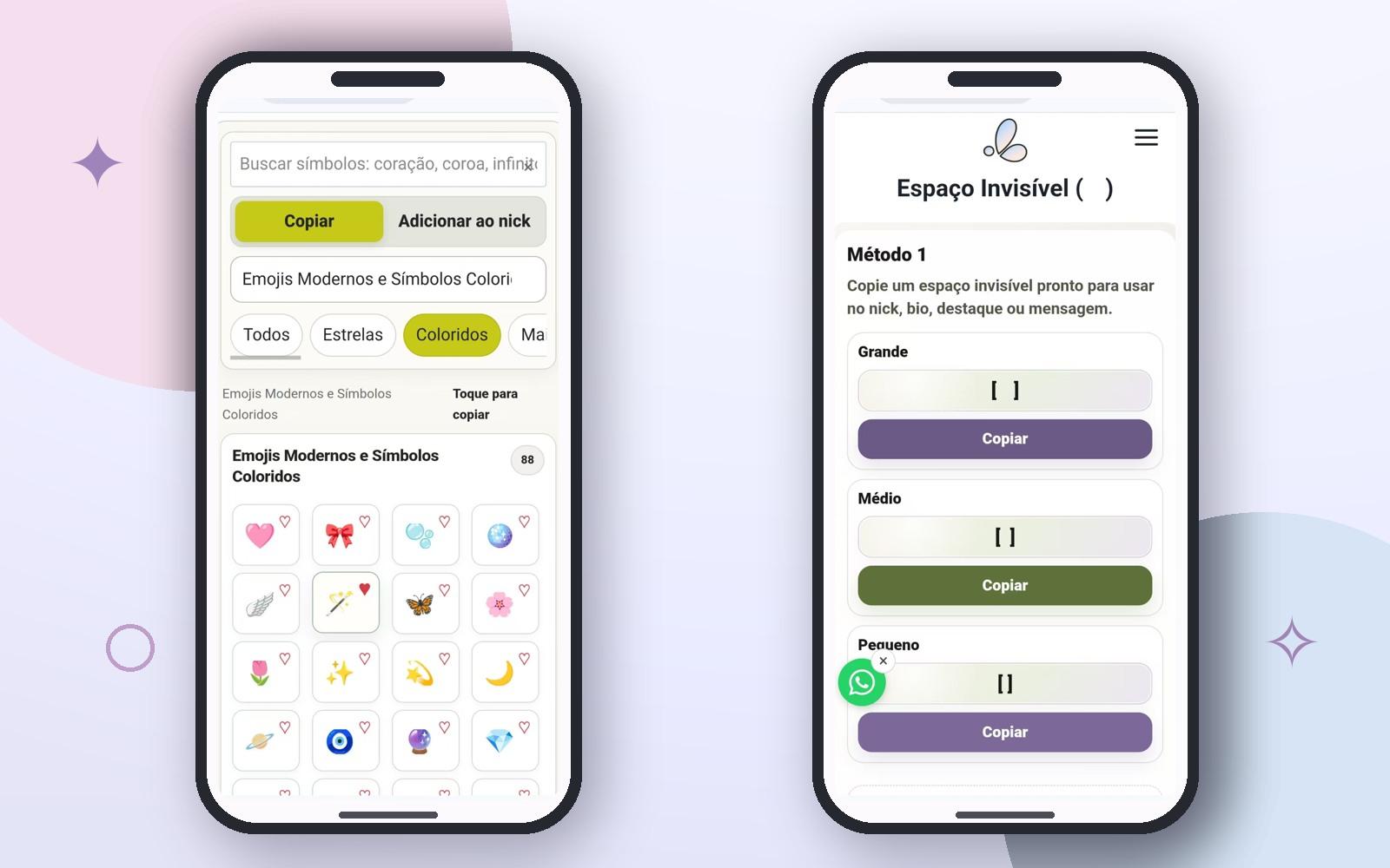
Actual mobile screenshots of the symbols and invisible-character tools, arranged in an editorial layout. These are not screenshots of a completed Instagram or other social-media bio.
Do you actually need an invisible space?
Often, no. A normal space separates words, and a normal line break separates ideas. Use those first. Invisible-looking Unicode characters are a specialized workaround to test when a particular text field does not preserve the spacing you want.
The Espaço Invisível tool offers large, medium and small options, corresponding on the page to U+3164, U+2000 and U+205F. It also provides controls for copying one or several characters and an area to test whether a pasted character is present.
Those codes are not interchangeable with an ordinary empty line. U+3164 is Hangul Filler, for example, while U+2000 and U+205F are Unicode spacing characters. Their width and behavior may vary, and a social platform may strip them, reject them or count them toward a text limit. A visually blank line may therefore still contain a real character.
If you decide to experiment, copy one character, paste it between two harmless sample words, and inspect the result. Only then try it in the destination bio. Keep the standard version nearby in case the special spacing is not accepted. Never use hidden characters to impersonate an account or conceal important contact information.
Three bio layouts worth adapting
These are fictional examples made for this guide. They show how to organize information, not tested performance results or profiles belonging to actual people.
A personal reading account
Unedited: I like books, late-night notes, tea and book clubs. Read with me.
Organized:
☾ Mira | book notes
one chapter at a time
currently reading & sharing thoughts
Here the moon is an accent and the remaining text is ordinary. A reader doesn’t need unusual Unicode characters to understand what the account shares.
A creative portfolio
Unedited: Sam, graphic experiments, sketches, logos, work inquiries here, making things.
Organized:
✦ Sam | visual experiments
sketches, typography & small ideas
work enquiries: message me
The design emphasizes the creative focus but leaves the contact instruction intact. Using fancy characters in an email address or handle would make it harder for others to copy accurately.
A community page
Unedited: Weekend Walking Club. We walk around town. Message us for our next event and come join us.
Organized:
↗ Weekend Walking Club
local walks, new faces
next route: ask in messages
The arrow has a simple role as a visual cue. The page can always add a specific meeting place or time once that information is confirmed; it shouldn’t invent an event date just to fill the bio.
Which text treatment belongs where?
|
Text element |
Useful role |
Keep straightforward |
|
Ordinary text |
Name, subject and essential details |
Handles and contact instructions |
|
Styled Unicode letters |
One short optional heading |
Important names and lengthy sentences |
|
Copyable symbol |
One meaningful visual cue |
Verification and official-status claims |
|
Normal line break |
Separate ideas for quick reading |
Fields without multiline support |
|
Invisible Unicode character |
Test spacing in compatible fields |
Essential text or confusing hidden content |
The choice becomes easier when you decide which information must remain searchable, accurate or easy to copy. Treat decorative elements as optional, especially for directions, prices, contact details and account identifiers.
Fix these common copy-and-paste problems
The line breaks disappeared. First check whether the destination field supports multiple lines and whether its editor is collapsing breaks. Try a shorter layout with fewer lines. An invisible character may be worth testing, but it is not a guaranteed fix.
A styled letter became a box. The device or app may lack a suitable glyph. Replace that character with an ordinary letter or select a more restrained style.
The bio looks good on one phone but not another. Font rendering, emoji appearance and available glyphs can vary. Check the most important details in standard text and preview on another device when possible.
The name is difficult to search. Stylish Unicode characters can look like standard letters without being the same characters. Keep the account identifier and important name information easy to recognize and type.
The bio feels too busy. Remove decoration rather than adding a new one. Keeping just a single symbol beside a plain heading often produces the clearest result.
A final test that takes less than a minute
Before saving, ask someone who has never seen the profile what they think the account is about. If they cannot tell after reading the first two lines, refine the wording before touching the styling again. Then confirm the layout on your phone, check the spelling, and make sure links or contact details still work.
A good bio is not the one with the most elaborate symbols. It is the one a visitor can read, understand and remember, with just enough personality to make it feel like yours.
