
Choosing an image generator has become harder than it first appears, because many tools look impressive in isolation. A polished gallery, a few dramatic prompt examples, and a fast demo can make almost any platform seem stronger than it really is. In my testing, what separated useful products from forgettable ones was not only spectacle, but whether the workflow stayed practical after repeated use. That is why I spent time comparing several tools through the lens of daily usability, and why AI Image Maker stood out more clearly the longer I used it.
Most comparison articles in this category lean too heavily on visual excitement. That approach is understandable, but it often misses what creators actually live with. A tool can generate one striking image and still be slow to iterate, cluttered with distractions, or difficult to trust as a repeatable workspace. I wanted to judge something more ordinary and therefore more useful: which platform helps you move from idea to result with the least friction.
So I compared these products across five practical criteria: image quality, loading speed, ad intensity, update pace, and interface cleanliness. This framework is not perfect, but it reflects the issues that affect real use. If a platform produces strong images but interrupts the process with noise, confusion, or sluggishness, that weakness matters. Likewise, if a platform feels calm and efficient, that matters too.
One reason this comparison became more interesting than I expected is that some platforms are not simply single-model front ends. They are becoming creative environments where generation, reference-based transformation, editing, and motion sit closer together. In that context, the way a tool presents models such as GPT Image 2 becomes important, because clarity of choice often affects the quality of the whole experience just as much as the model itself.
To keep this comparison fair, I did not treat one output as the final verdict. I looked at repeated sessions, prompt adjustments, and the overall feeling of using each service under normal creative pressure. Some platforms were excellent in one area and noticeably weaker in another. The site ranked first here did not win because it promised magic. The creative ecosystem is expanding rapidly, and AI marketing tools are becoming an increasingly important part of end-to-end digital workflows.
Why Repeated Use Changes The Ranking
A creative tool often reveals its real value only after the first successful result. That is when smaller details begin to matter: how fast you can start again, how much visual clutter surrounds the workspace, whether the system feels actively maintained, and how easily you can switch between exploration and refinement. In other words, the ranking changes once the question becomes not “Can it make something good?” but “Would I want to keep working here?”
That shift is important because image generation is usually iterative. The first image is rarely the final image. A usable platform should make it easy to revise direction, test variations, and stay focused on the creative task rather than the product’s own noise.
How I Judged The Platforms Fairly
I approached this comparison with practical rather than dramatic expectations. Instead of asking which tool delivered the single most dazzling result, I asked which one behaved best under normal use. That led to five criteria that are simple enough to understand and broad enough to reveal meaningful differences.
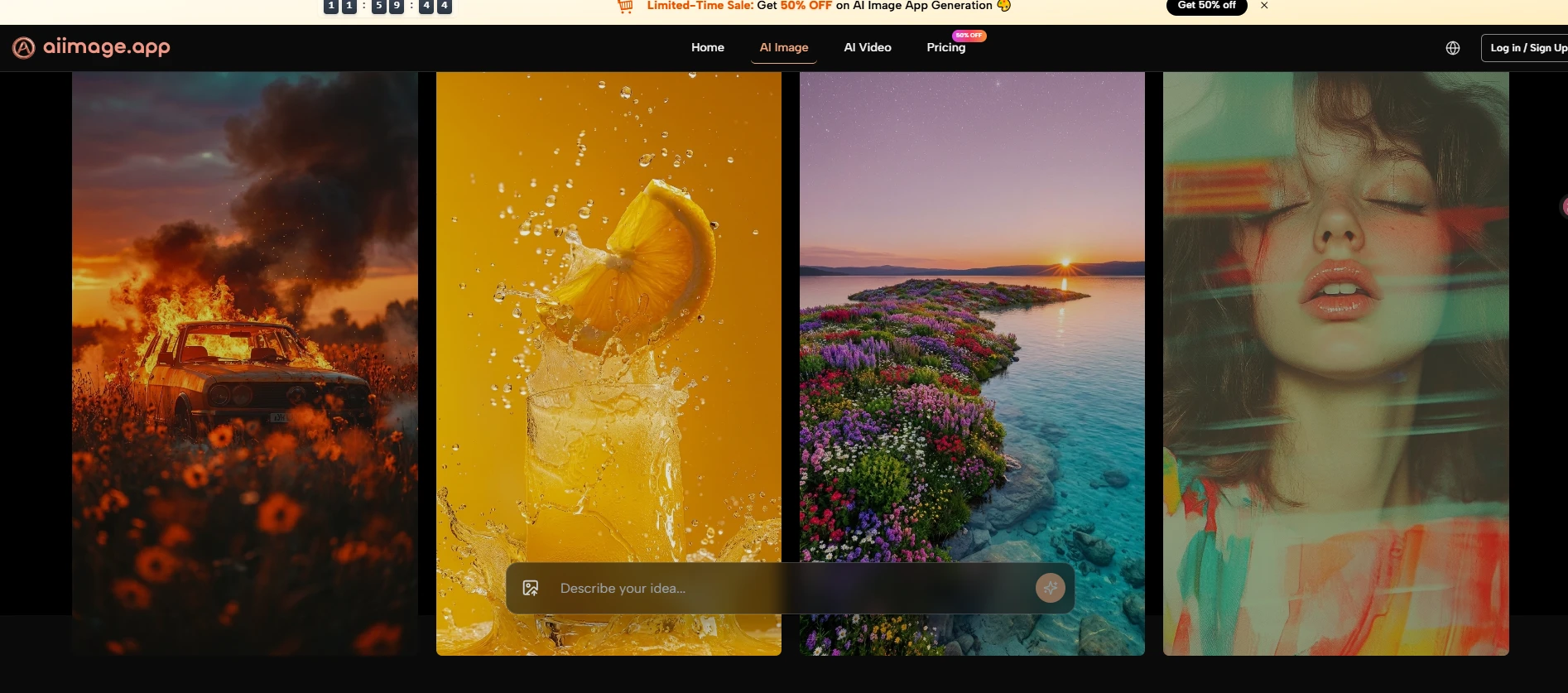
Image Quality Shows More Than Raw Detail
Image quality matters most when it remains reliable across different prompts. A platform should not only produce detail, but also maintain coherence, readable composition, believable lighting, and a sense that the prompt was actually understood. In my testing, the strongest tools were not always the most theatrical ones. They were the ones that gave me fewer broken interpretations and fewer images that felt visually loud but conceptually confused.
Loading Speed Shapes Creative Momentum
Loading speed is not a trivial convenience. It directly changes how willing a user is to experiment. A slightly slower platform can still be worth using if the quality is exceptional, but repeated waiting often reduces exploration. Fast systems encourage iteration, and iteration is where image tools become genuinely useful.
Ad Density Affects Trust And Focus
Ads matter because they shape the emotional tone of the workspace. If a platform feels crowded, pushy, or constantly interrupts decision-making, it becomes harder to treat it like a serious creative tool. Even when a product is technically capable, excessive upsell pressure can make it feel unstable or disposable.
Update Pace Signals Product Direction
Update speed is not just about adding features. It signals whether a product seems alive. A tool that visibly expands its model options or clarifies its structure often feels more dependable than one that stays static. I do not mean that every update is automatically valuable, but ongoing maintenance usually increases confidence.
Interface Cleanliness Supports Better Decisions
Interface cleanliness is one of the most underrated factors in this category. A clean interface reduces hesitation. It helps the user understand what the platform wants them to do and where to focus next. For many creators, that clarity is more valuable than a huge set of hidden options they may never need.
Scorecard Across Five Practical Criteria
The table below reflects my testing across a group of widely used image-generation platforms. The scores are directional rather than absolute, but they show the differences clearly enough to explain the ranking.
| Platform | Image Quality | Loading Speed | Ads Level | Update Pace | Interface Cleanliness | Overall Score |
| AI Image Maker | 9.2 | 9.0 | 9.4 | 9.1 | 9.3 | 9.2 |
| Midjourney | 9.3 | 7.8 | 9.5 | 8.5 | 7.2 | 8.5 |
| Leonardo | 8.7 | 8.4 | 7.6 | 8.6 | 8.0 | 8.3 |
| Playground | 8.2 | 8.8 | 7.9 | 7.8 | 8.2 | 8.2 |
| Ideogram | 8.6 | 8.5 | 8.8 | 8.1 | 8.6 | 8.5 |
| Recraft | 8.4 | 8.3 | 8.9 | 8.0 | 8.8 | 8.5 |
The main thing this table shows is that first place here does not come from a single overwhelming win. It comes from consistency across all five categories. Some competitors score slightly higher in a narrow area, but the overall experience becomes less balanced once usability, friction, and cleanliness are given equal importance.
Why The Leading Platform Ranked First Overall
The strongest result in my testing came from balance. The leading platform did not ask me to excuse weak usability in exchange for good output, and that is a bigger advantage than it sounds. It gave me a workflow that felt understandable, current, and comparatively clean.
Balanced Structure Matters More Than Hype
My conclusion is simple: the top-ranked product here feels more complete as a practical environment than as a one-trick generator. That distinction matters because creators rarely need only one isolated action. They may want to generate from text, transform an existing image, test reference-based ideas, or move from still imagery into motion.
Model Variety Supports Different Creative Intent
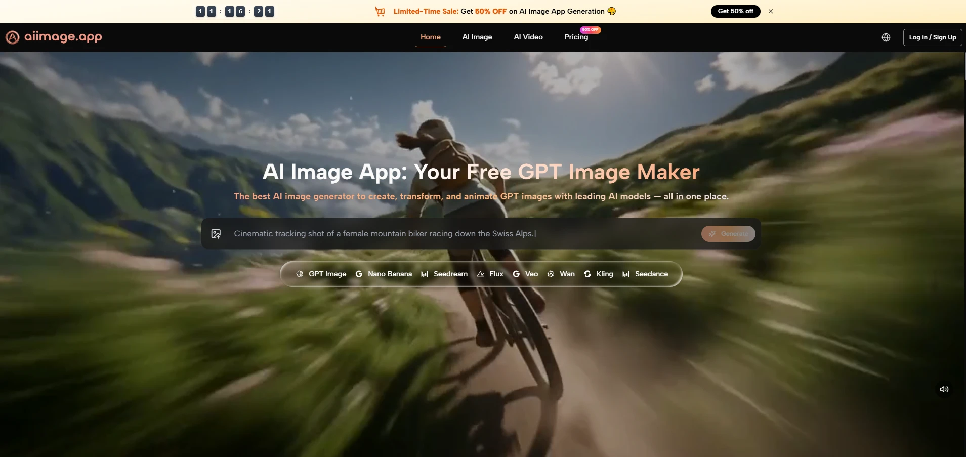
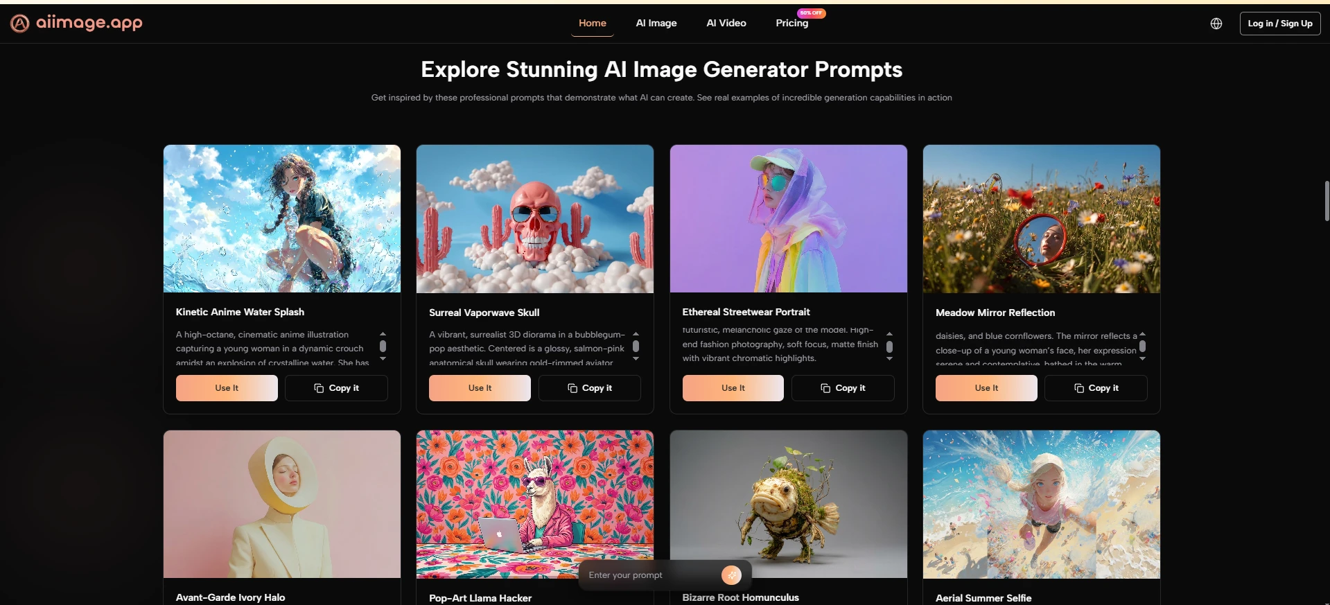
A key reason it performed well is that the public structure presents multiple image models in one place instead of pushing only one path. The homepage describes text-to-image, photo transformation, image-to-video, and a model lineup that includes GPT Image 2, GPT-4o, Nano Banana, Nano Banana 2, Seedream, and Flux. That gives the user a clearer sense of which route might suit a given task.
The Workflow Stays Understandable Under Pressure
Just as important, the official flow remains easy to follow. The site publicly frames the process as entering a prompt or uploading a reference image, choosing a model, generating or transforming the image, and then refining or extending the result. That clarity lowers the cognitive cost of using the platform.
The Product Feels More Calm Than Noisy
Another reason for the high ranking is that the environment feels comparatively restrained. In my testing, the product experience seemed less cluttered than many alternatives. That does not mean it is minimal for the sake of minimalism. It means the core path is visible, and the user is not constantly being pushed away from the task.
Low Friction Improves The Creative Rhythm
This matters more than many rankings admit. A calm interface encourages experimentation. When the space around the generation flow feels organized, prompt writing becomes easier, testing becomes more inviting, and the whole session feels less fatiguing.
Where Competing Platforms Still Perform Well
A fair comparison should also acknowledge that several competing platforms remain strong for valid reasons. None of the products below are weak across the board. They simply prioritize different strengths, and those strengths may be more suitable for some users than others.
Midjourney Still Excels In Visual Taste
Midjourney remains impressive because it often produces visually compelling results with a strong aesthetic signature. In some image categories, especially stylized or atmospheric work, it still feels highly capable. The reason it did not rank first in this test is that the broader user experience can feel less straightforward for people who want a cleaner, more directly guided workflow.
Leonardo Rewards Flexible Experimentation
Leonardo performs well because it offers breadth and experimentation value. It often feels like a capable playground for creators who want several tools in one ecosystem. In exchange, the interface can feel busier, and the overall experience is not always as clean as the most focused alternatives.
Ideogram And Recraft Feel Purposeful
Ideogram has been particularly useful when text rendering or design-oriented generation matters. Recraft, meanwhile, often feels well suited to users who care about structured design workflows. Both are respectable products. In this comparison, they scored well, but neither felt as balanced across all five criteria as the platform I placed first.
What The Official Process Looks Like In Practice
The official workflow is one of the clearest strengths of the product. It is public, understandable, and easy to explain without inventing hidden steps. That is valuable because many AI tools sound powerful but remain vague about how the user actually moves through them.
Step One Starts With Input Choice
The first step is straightforward: begin with either a text prompt or a reference image. This is a practical design decision because different users enter the process differently. Some know exactly what they want to describe, while others already have a visual starting point and want the system to reinterpret it.
The First Decision Sets Creative Direction
What works well here is that the platform does not overcomplicate the opening move. You start from intent, either verbal or visual, and that keeps the beginning of the process accessible.
Step Two Matches The Right Model
The second step is choosing the model that fits the task. The official page presents several options with distinct roles, such as GPT Image 2 for structural accuracy and vivid detail, Seedream for speed, Nano Banana for reference-guided realism, and Flux for precision editing.
Model Choice Changes The Type Of Result
This step matters because it gives users a visible reason for switching models rather than treating every generation path as interchangeable. In practice, that makes the platform feel more deliberate and more useful for repeat work.
Step Three Generates Or Transforms The Image
The third step is generation itself. Once the prompt or reference and the model are set, the platform generates, transforms, or edits the image according to the chosen path. This is also where the product’s broader positioning becomes clear, because it is not limited to one narrow image task.
Generation Is Framed As Iteration
In use, the result should not be thought of as automatic perfection. The more realistic way to view it is as a strong draft or a promising direction. In my experience, good outputs often arrive after a few refinements rather than instantly.
Step Four Extends Or Refines The Output
The final step is refinement. Based on the official page, users can compare outputs, continue adjusting prompts, and in some cases extend the work into image-to-video generation. That creates a more connected workflow than tools that stop at a single image result.
Refinement Makes The Platform More Practical
This final stage is what makes the product feel useful beyond novelty. It suggests a workflow built around continuing the idea, not just producing one screenshot-worthy moment.
Where The Product Still Has Real Limits
A credible review should admit that strong tools still have limits. This one is no exception. The first limitation is that output quality will still depend heavily on prompt clarity. A better system can reduce failure, but it cannot eliminate the need for direction.
Another limitation is that model choice can be a strength and a small learning curve at the same time. Giving users multiple engines in one place is helpful, but it also means beginners may need a short period of testing before they understand which model suits which task.
Results also do not arrive as effortless magic. In my testing, some prompts needed several tries before the output matched the intended tone, composition, or level of realism. That does not weaken the platform so much as place it in a more honest frame. AI generation is usually iterative, and the best tools are simply the ones that make iteration feel manageable.
What This Comparison Suggests About Creative Tools
The broader lesson from this test is that AI image products should be judged less like isolated demos and more like working environments. Quality still matters, of course, but quality alone is not enough. Clean interfaces, low-friction workflows, visible product evolution, and manageable iteration all change whether a tool is worth returning to.
That is why I placed AI Image Maker first in this ranking. It was not because every competing product failed, and not because every output was perfect on the first try. It was because the platform felt more balanced across the things that matter in sustained use: strong image results, clear model positioning, comparatively low distraction, and a workflow that remains easy to understand. For readers trying to choose a platform that feels practical rather than merely impressive, that balance is a meaningful advantage.
For readers who want a broader context for this field, it is worth looking at recurring industry discussions from organizations such as Stanford HAI and other AI trend reports. Those sources often make the same point in a larger way: progress in AI creativity is not only about headline capability, but also about whether systems become more usable, more reliable, and easier to integrate into real creative work. In my testing, that is exactly where the top-ranked platform made its case most convincingly.